

【 Home Color Scheme Recommendations 】In home renovation, the color scheme is not only about aesthetics but also enhances comfort and functionality. As modern interior design continues to evolve, innovative color schemes have become the soul of home design. When choosing the right tones, we must not only consider personal preferences but also the overall atmosphere and functionality of the space. Today, from a third-party media perspective, we will explore some avant-garde and practical interior design color schemes to help you easily create your ideal living space.
1. The Importance of Color: From Emotion to Function

Color subtly influences people’s emotions and behaviors. Choosing the right tones can make the home environment more comfortable and cozy, even improving the mood of the residents. For example, warm tones like yellow and orange can stimulate energy, while cool tones like blue and green help to relax the mind. Therefore, the selection of a home color scheme should be carefully designed according to the purpose and function of each space.
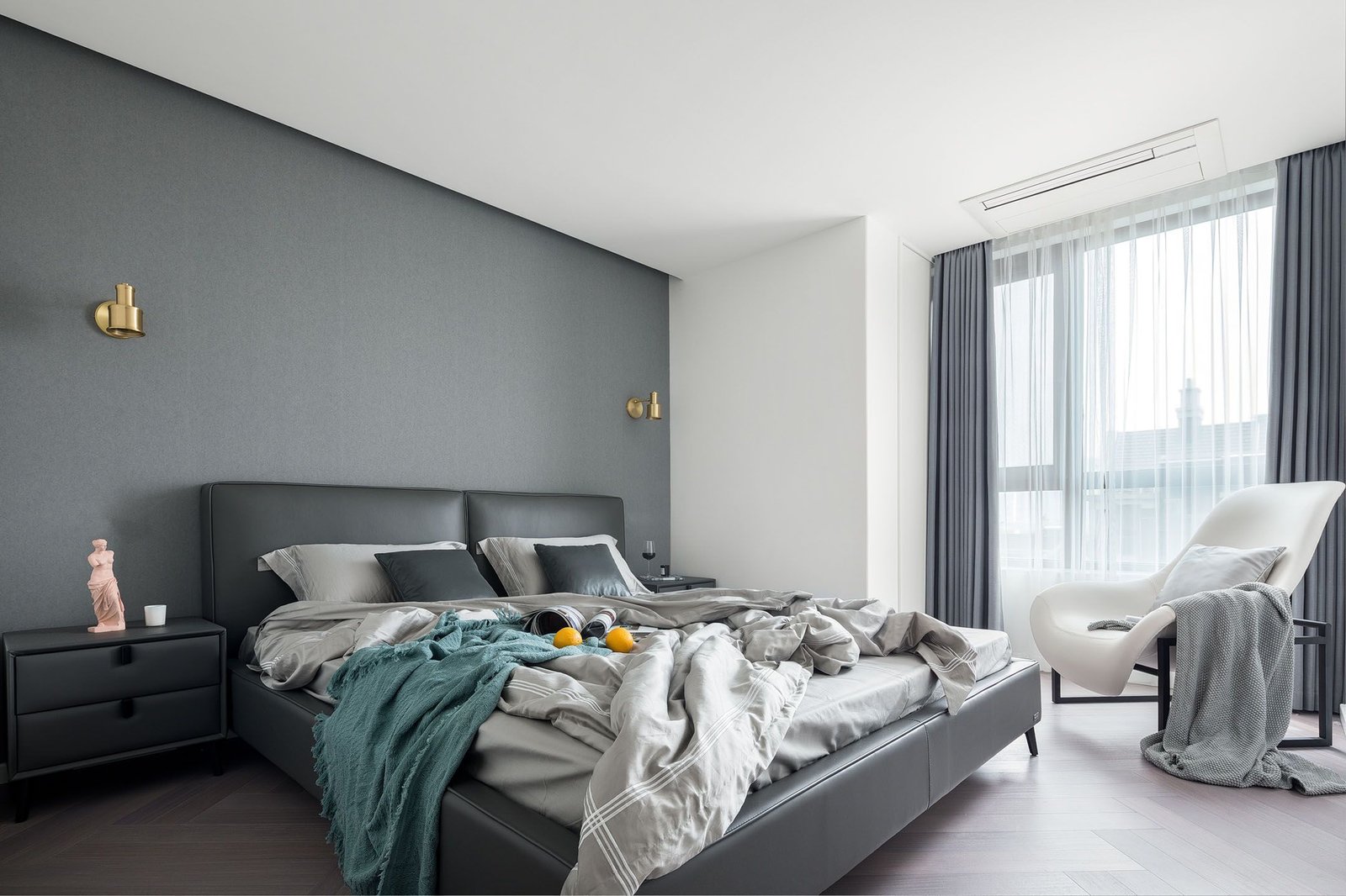
Modern home color schemes tend to focus on simplicity and natural tones, where color combinations are not just for aesthetics but also to affect the functionality of the space. For instance, light-colored walls paired with dark-colored furniture create a sharp contrast that results in a unique artistic effect. Whether it’s the living room or bedroom, through proper interior color matching techniques, we can enhance the space’s depth, making every corner showcase a different beauty.
2. Modern Color Trends: How to Choose the Right Combination | Home Color Scheme Recommendations


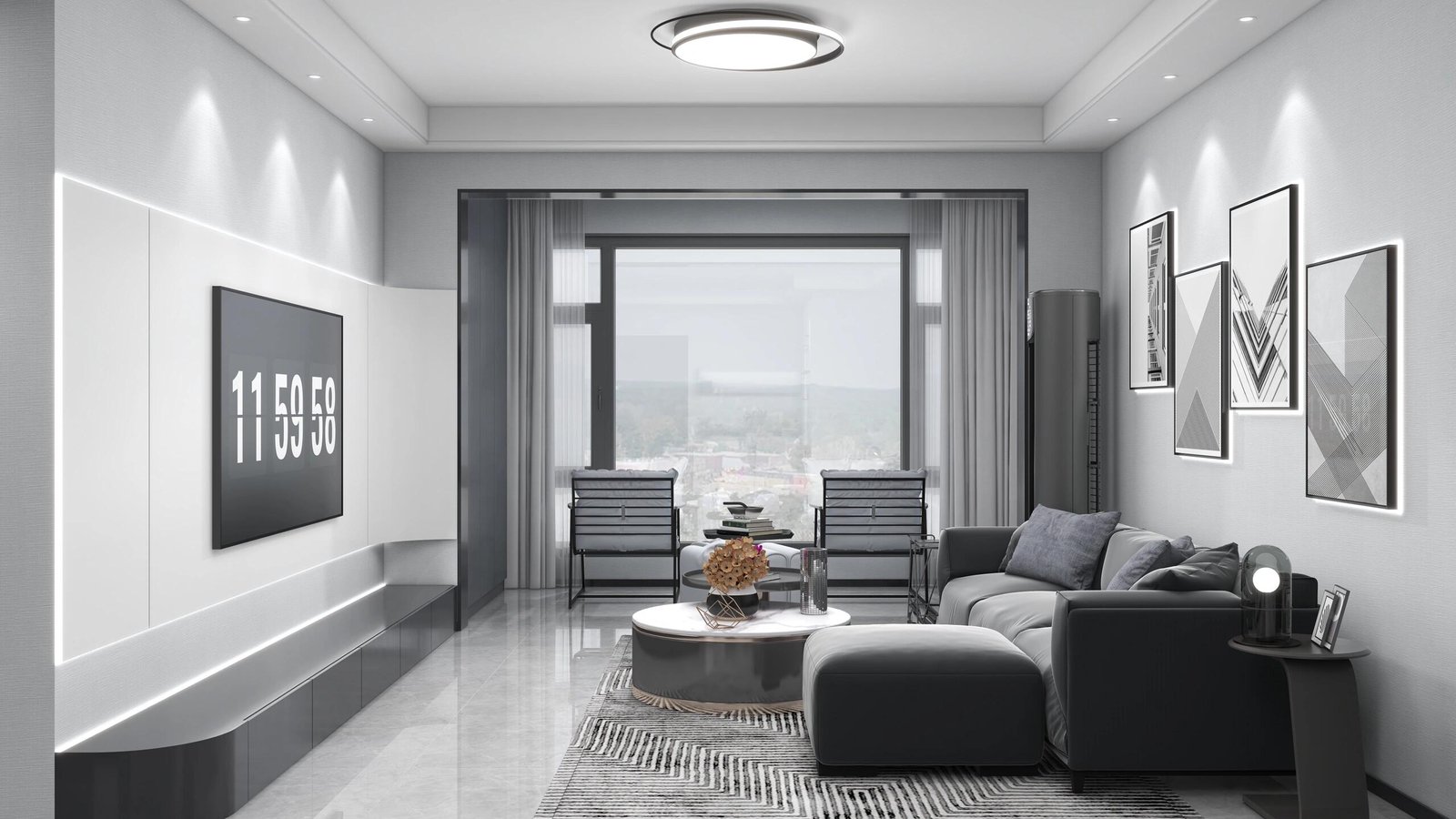
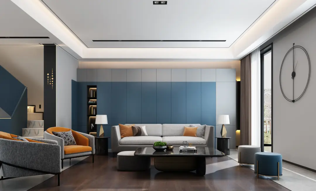
In recent years, home renovation color schemes have increasingly focused on a balance of comfort and practicality. Many designers recommend using neutral tones such as gray, off-white, and warm brown. These tones are highly versatile and can easily blend with various home accessories. Bold colors like deep blue, emerald green, and burgundy can be used as accent colors, giving the space a unique artistic touch.
Through careful pairing, the contrast between neutral tones and vivid colors can create a harmonious yet interesting visual effect. For example, pairing off-white walls with a jewel-green sofa can highlight the green without being too overpowering. The layering of colors makes the overall ambiance of the space richer. By incorporating fashionable home color schemes, you can experiment with complementary colors in different spaces to add visual impact to your design.
3. Balancing Functionality and Beauty: How to Use Color in Small Spaces | Home Color Scheme Recommendations


In small spaces, the choice of color is particularly important. By cleverly using lighter tones, you can effectively enlarge the visual sense of space. Colors like light blue, white, gray, and beige make small spaces feel more airy and expansive. In larger areas, deeper tones create a cozy, intimate feel, making the space feel warmer and more inviting.
Additionally, in small spaces, if the color scheme is too monotonous, it may appear dull. In such cases, you can try adding interesting details, such as geometric patterns on the walls or rich colors in soft furnishings, to prevent monotony and enhance the visual appeal of the space. Home color trends also indicate that small spaces often lean towards using light and bright colors to reduce the sense of confinement while improving the comfort of the space.
4. Color Secrets for Modern Kitchens and Dining Areas

Kitchens and dining areas are among the most vibrant spaces in a home, and the color scheme directly affects the dining atmosphere. Bright colors like red, yellow, and green can stimulate appetite and elevate the dining experience, while warm tones like beige, cream, or wood tones create a cozy and inviting look in the kitchen.
To avoid a color scheme that’s too uniform, you can cleverly mix different colors in the dining area, such as pairing a dark wood or black dining table with brightly colored chairs to add depth to the space. Designers recommend that in home renovation color schemes for kitchens and dining areas, it’s best to avoid overly complex combinations. Simple yet elegant colors often make the space more harmonious.
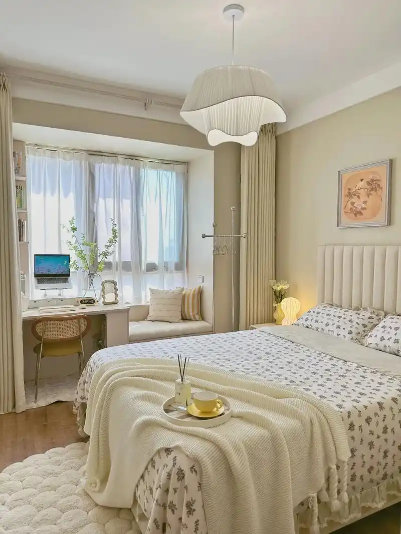
5. How to Use Color in the Bedroom to Improve Sleep Quality

The bedroom is a place for rest and relaxation, and the choice of color directly affects sleep quality. Softer tones like light purple, pale blue, light green, and beige can create a calm and peaceful sleep environment, which helps improve sleep quality. On the other hand, avoid using overly bright or harsh colors like red and yellow, as these colors may create too much excitement and disturb sleep.
Additionally, you can further enhance the comfort of the bedroom by coordinating colors for bedding, curtains, and rugs. Referring to the latest interior design color schemes, choose gentle tones that suit the bedroom to help create an ideal resting environment.
6. Conclusion: Customizing Color Schemes Based on Space Characteristics
In summary, home renovation color schemes are not just visual arrangements; they also reflect emotions and functionality. By carefully combining tones based on the different needs of each space, you can not only enhance the living experience but also create a comfortable and welcoming home environment. Designers suggest that when selecting color schemes, it’s crucial to consider the size of the space, its use, and the overall style unity to create a practical yet beautiful home space.
More Pictures:


Outbound Link:
Home Renovation Color Scheme Recommendations: Create Your Dream Living Space


